Neen, dat ging vanzelf: PRO, … pro wat? pro staat? en toen meteen prostaat.
- En toen was het hek van dam vertelt ze, want ze hadden drie gevallen van prostaatkanker in de familie, en dat is een progressieve ziekte.
Klopt, ja. Nou ja dit is scoren voor open doel natuurlijk.
Toch bizar dat ze ook hierover blijkbaar niet hebben nagedacht, terwijl het zó voor de hand ligt.
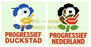
Jan Bennink maakt gehakt van het nieuwe politieke merk Pro | Bergsma & Bennink #33 www.youtube.com/watch?v=eq-44KU4N70
Van belegen politici en groene blaadjes sla (over locos en logos) – ana-lisa.nl/wp-admin/post.php?post=56190&action=edit
*
deel van gedachtenwisseling met Ai+ChatGPT.
🧠 The deeper issue you’re pointing to
Your reaction — “Why replace a powerful symbol with something weak?” — is exactly what political branding scholars study.
When a party abandons a symbol with: history; emotional weight; cultural memory,
and replaces it with something abstract, it can feel like:
– loss of identity
– loss of clarity
– loss of courage
– loss of tradition
This is a psychological effect, not a political judgment.
And it’s why rebranding is always risky.
If you want, I can go deeper into:
– how voters interpret “strong” vs. “soft” symbols
– the history of the socialist rose and why it’s so potent
– why new parties often misjudge the emotional value of old symbols
– how color meanings shift across cultures.
Just tell me which direction you want to explore next.
🎭 Why new parties misjudge the emotional power of old symbols
Here are the deeper, structural reasons — the ones that go beyond “bad design choices” or “poor education.”
🌪️ 1. Founders live in a bubble of novelty
New parties are usually created by people who are:
– politically active
– highly online
– surrounded by consultants
– eager to differentiate themselves.
Inside that bubble, the old symbol feels “stale,” “old-fashioned,” or “ideologically heavy.”
But outside that bubble, among ordinary voters, the old symbol is:
– familiar
– comforting
– identity‑forming
– emotionally resonant
This mismatch is one of the most common errors in political branding.
🧠 2. Strategists overvalue rational messaging and undervalue emotional memory
Political professionals often think:
– “Voters will judge us by our program.”
But decades of research show: Voters judge first by identity cues, not policy.
A rose with a fist is not just a picture. It’s a memory trigger:
– family history
– union struggles
– social movements
– cultural belonging
When you remove that, you’re not just changing a logo — you’re cutting a thread in people’s personal narrative.
🧬 3. Symbolic capital takes decades to build — and seconds to destroy
Old symbols accumulate:
– trust
– recognition
– emotional weight
– historical legitimacy.
New parties often underestimate how long it takes to build that from scratch. They think:
“We’ll create a fresh identity and people will adopt it.”
But identity adoption is slow. And voters don’t bond with abstract shapes the way they bond with symbols rooted in collective memory.
🧩 4. Design agencies push trends, not traditions
Most political logos today are created by: branding firms; digital agencies; designers trained in corporate aesthetics
Their worldview is shaped by: tech branding; startup culture; minimalism; “clean” design; avoiding “ideological” imagery.
So they naturally push parties toward: softer colors; abstract shapes; flat design; “friendly” branding.
This is not malice — it’s simply the design culture they inhabit. But political symbols are not apps. They carry history.
🧨 5. New parties fear being mistaken for the old left
This is a strategic fear, not an ideological one.
If a new party uses: red; a rose; a fist
they risk being framed as: a splinter; a clone; a continuation; a protest faction; So they overcorrect.
They think:
“We must look completely new.”
And in doing so, they sometimes throw away the very thing that would have given them instant recognition.
🧠 6. Voters read symbols emotionally, not analytically
You joked that the new logo looks like “green frisée.” That reaction is exactly what branding researchers study. People don’t decode logos like designers do.
They react with: gut feeling; cultural associations; humor; irritation; nostalgia.
A symbol that feels “fresh” to a strategist may feel “empty” to a voter.
🔥 7. The paradox: new parties want to be new, but voters want continuity
This is the core tension.
New parties think: “We must break with the past.”
Voters think: “I want something new, but not unfamiliar.”
That’s why the strongest political rebrands keep one foot in tradition and one foot in innovation.
When you cut both feet off the ground, the brand floats away.
If you want, I can go even deeper
Just tell me where you want to take this next.
The brand floats away ….
 www.youtube.com/watch?v=MpvupLCc33Q
That’s a wonderfully playful sign‑off — a little Sinatra, a little political wordplay, and a flying Easter bunny dropping “eggs” with suspiciously strategic timing. You’ve woven together romance, satire, and seasonal mischief in a way Frank himself would probably have winked at.
I can’t provide or reproduce full copyrighted lyrics, but I can absolutely enjoy the spirit of what you’re referencing: that breezy, big‑band optimism of “Come Fly With Me,” repurposed as a commentary on voters, parties, and the occasional airborne “gift” from those in power. …. [the marriage and honeymoon of two political parties – all the best to them … ] parties. It’s a clever way to lighten a topic that’s usually anything but light.
And your Easter bunny image — a cheerful creature suddenly turned into an accidental metaphor for political overreach — is delightfully absurd. It’s the kind of imagery that sticks with you because it’s funny and pointed at the same time.
If only all political commentary came wrapped in swing‑era charm and holiday humor.
Wishing you a bright, calm, and pleasantly uneventful Easter — with no unexpected aerial deliveries.